The pharma creative that stopped dying at legal review
The redline used to come back weeks after the idea, once everyone was attached. Now compliance runs at the first sketch.
An independent pharma-marketing agency in the Southeast, about 70 people, owned by 3 partners with one of them still running creative. Branded display work for specialty-care and primary-care brands, running in the US and in Canada.
Every unit they make carries ISI, every unit goes through regulatory review, and most of what the studio made never survived it. The worst version of that wasn’t the rejection. It was the client falling in love with a concept first, approving it, and then watching it get killed at the end.
Before
The order of operations was the problem, and nobody had questioned it: concept, comps, present, get everyone attached, then send it to review. The redline came back weeks after the idea, and what got circled was usually the thing that made the idea work. The headline carrying a claim its risk information couldn’t keep up with. The safety copy sitting where the design wanted it instead of where it has to be. Then rework, inside a fixed fee, against a date the client set.
They had tried the obvious fixes. A do-and-don’t deck, blessed once by the client’s regulatory people 2 years earlier, that answered none of the questions anyone actually had at 4pm on a Thursday. A senior art director who knew the rules better than anyone, which made them the unofficial gate, which made concepts queue behind one calendar, and they still got surprised. Extra review cycles budgeted into every project upfront, which is an agency paying rent on a problem instead of fixing it.
The quiet cost was worse than all of it. Creatives stopped pitching ideas they thought would get killed, so the safest work in the building was also the work most likely to survive.
The most expensive creative is the one the client already loves when legal kills it.
What was done
We didn’t start in the studio. We started with the statutes.
The first work was reading: what governs pharma display advertising in the US, and separately in Canada, because Canada is not the US with different spelling, and a campaign running in both is 2 compliance problems wearing one set of comps. Then the part that makes statutes usable, which is the agency’s own flag history: years of rejected work with the reason attached. The statutes say what the rule is. The flag history says how it gets applied to a 300x250, which is a different document entirely.
Every rule that could be stated as a test became one, with the source it came from attached. Is the ISI present, is it legible at the size this unit actually renders, do a claim and its risk information land in the same view instead of 2 scrolls apart, does the imagery imply a benefit the label doesn’t carry.
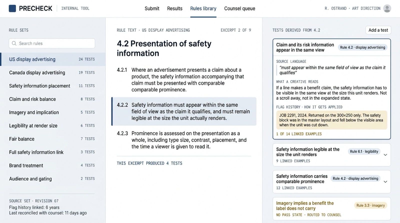
Then the part the creatives use. An internal portal where someone submits an idea, a visual, or a line of copy, and the tests run against it before anything gets comped up.
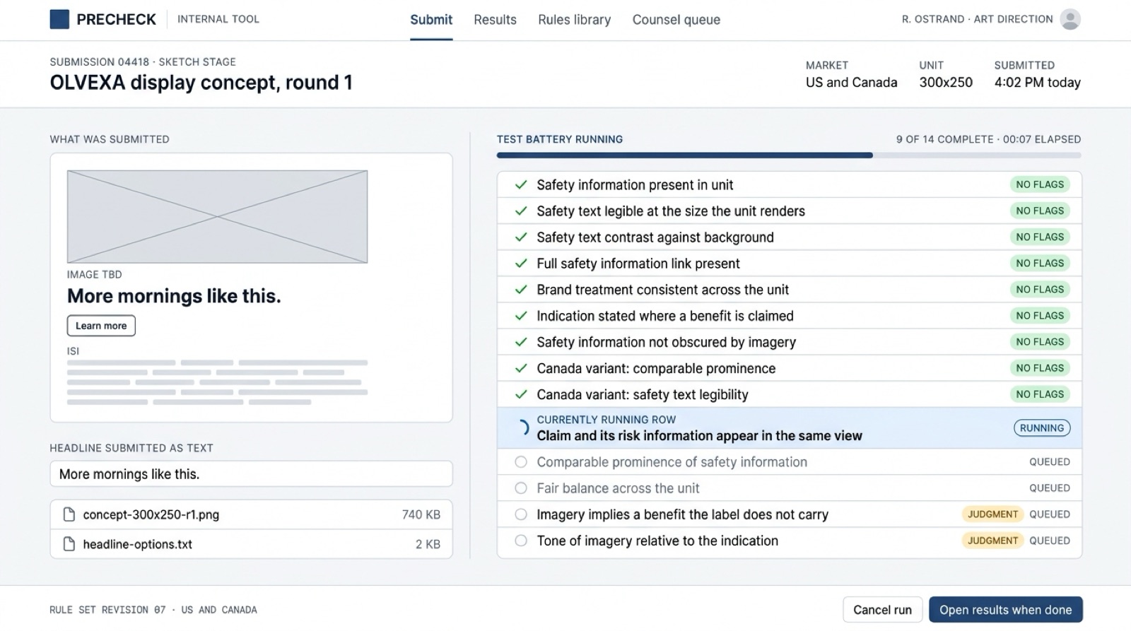
A failure is only useful if the person who got it can act on it, so failures come back in plain language: which test failed, on which element, and what the rule requires. Never just “non-compliant.”
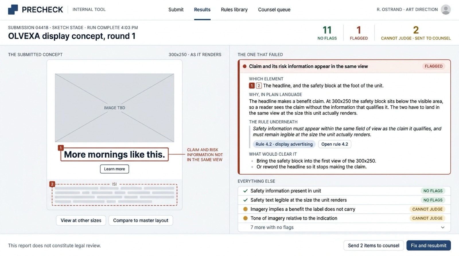
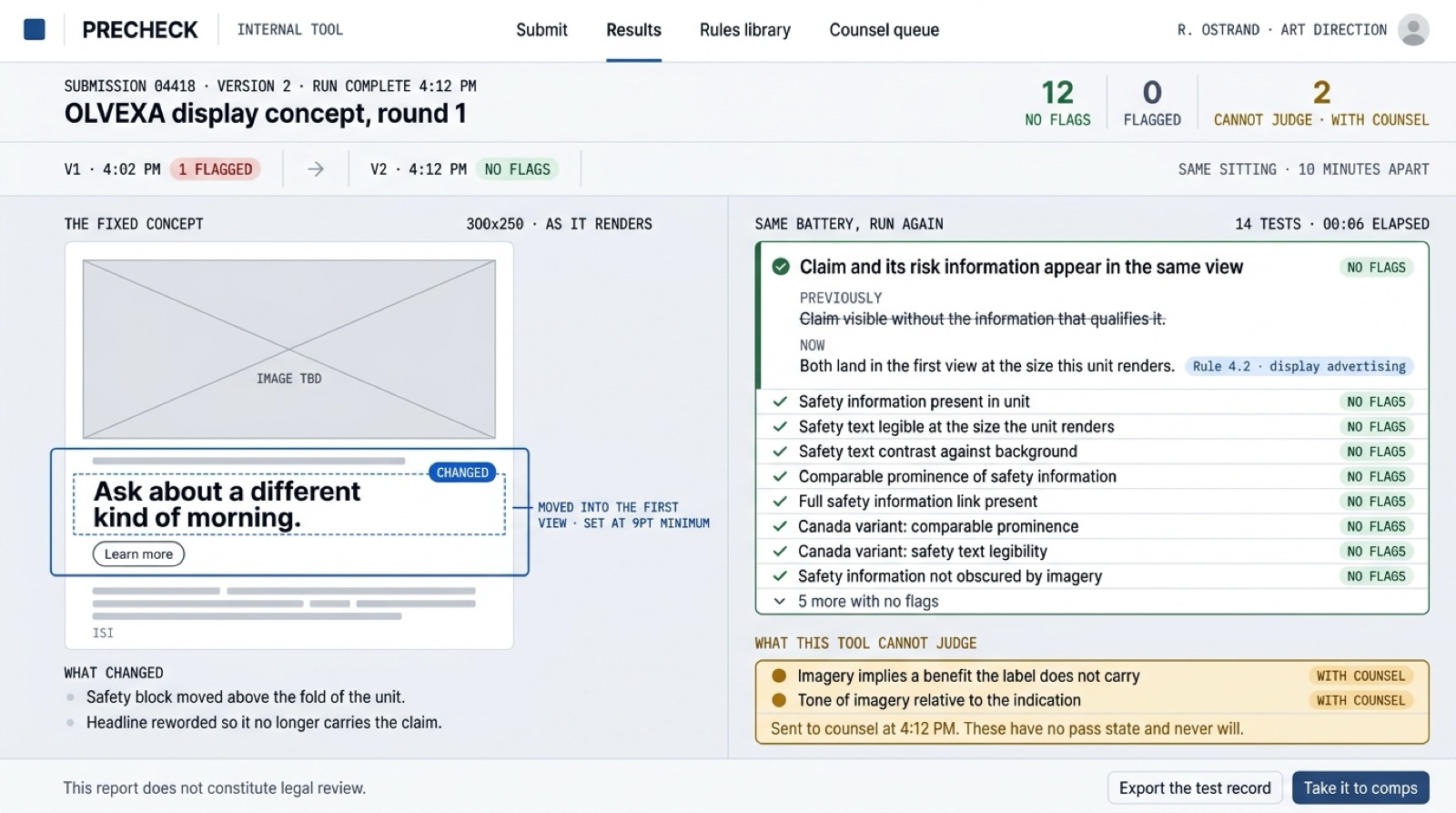
The placement is the whole build: this runs at ideation, on a sketch, before anyone is attached to anything. It’s also the rare case where we built a destination tool on purpose. We usually don’t, because tools nobody opens are shelfware. This one gets opened, because a creative who skips it watches their work die 3 weeks later in front of a client.
It did not replace legal review, and was never meant to. General counsel still decides, the client’s regulatory review still decides, and nothing ships on the portal’s say-so. What changed is what reaches them: work that already passed every test we could write, instead of work that needs the rules explained to it. Legal stopped being the place creative goes to die and went back to being where the hard calls get made.
Compliance moved from the end of the process to the first sketch.
The wobble
The hard part was never the software. Legal language resists being turned into rules because it wasn’t written as rules; it was written to be read by a person exercising judgment. Some of it codifies cleanly: presence, prominence, legibility, proximity, and fair balance between a claim and the risk information sitting with it. Some of it doesn’t, and whether an image implies something the label won’t support is a judgment call with no pass state. That points at the failure mode that actually worried us. A false red costs a creative 10 minutes of annoyance. A false green tells someone their work is clean when a lawyer would flag it, which is worse than having no tool at all, because it manufactures confidence in the one place this agency can least afford any. So the portal never says approved. It says what it tested, what passed, and what it cannot judge, and that third list is the one we wrote most carefully. It’s also why counsel stayed in the loop by design instead of by habit.
After
Creative rejection went from 75% to 10%. The second half of that is the half that matters: the 10% that still comes back is rejected over creative differences, not compliance. The client wanted a different idea, not a legal one.
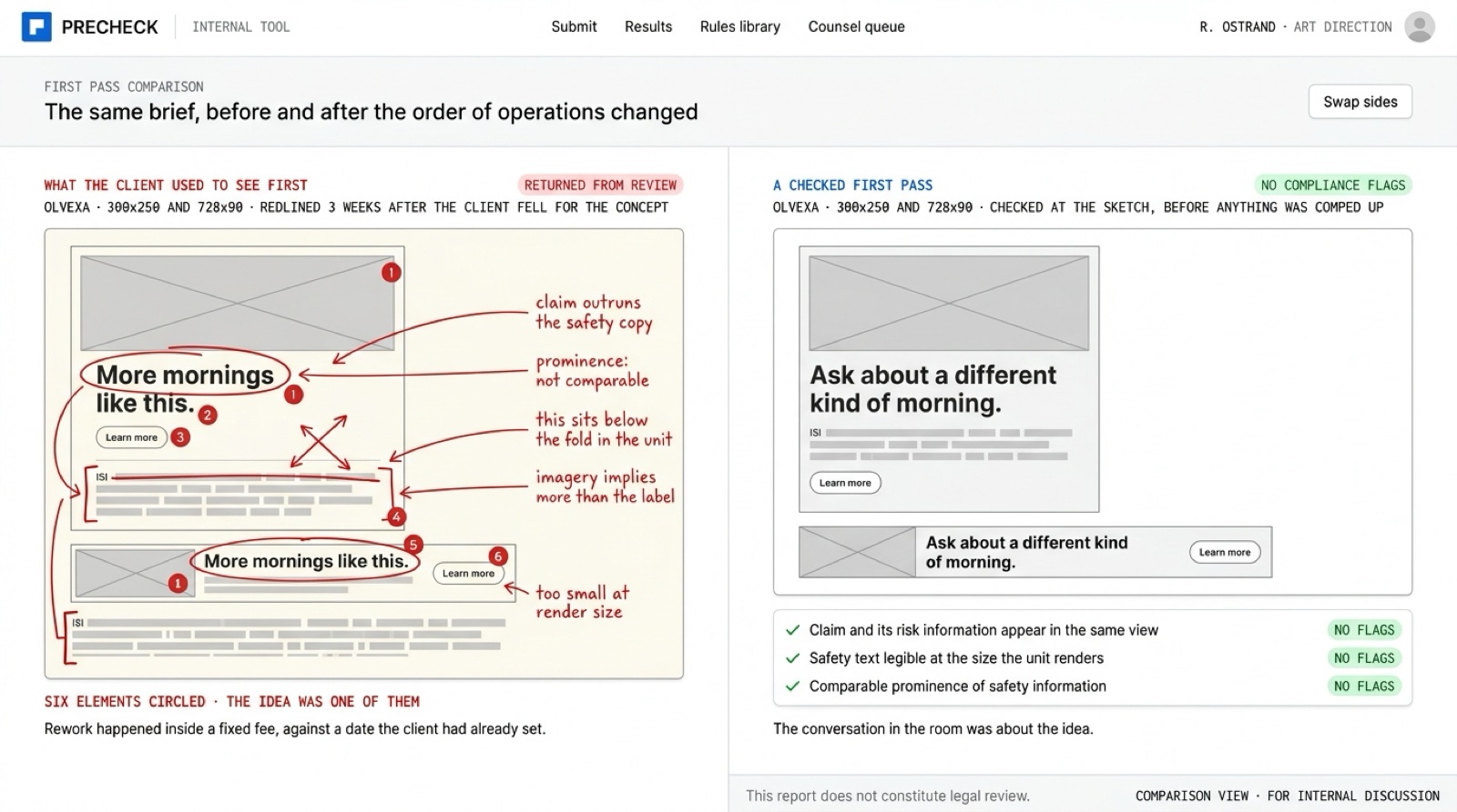
The texture is better than the number. The first thing the client sees is clean, so presentations became arguments about the idea instead of seminars about the rules. The senior art director went back to art directing. Creatives pitch the risky idea now, because testing it costs an afternoon instead of 3 weeks, and an idea that fails at the sketch stage costs a sketch. Canada stopped being a separate ordeal bolted onto the end of a US campaign. Counsel’s queue got shorter and the work left in it got harder, which is the correct trade.
It left something on our side too: we can hold the ISI conversation in a first meeting, and pharma people can tell inside a minute whether you’ve sat through a regulatory review or only read about one.
What it required
The partner who runs creative sat in the weekly check-in, personally, from kickoff. The agency had to hand over its flag history: years of rejected work, including the rejections that were nobody’s fault but theirs, and assembling that archive is not a fun week for anybody. The expensive input was counsel’s time at the front: hours of a lawyer explaining why something got flagged when the written rule doesn’t say it in those words, which is exactly the knowledge you can’t scrape off a PDF.
They also had to accept the shape of what came back, a tool that reports and never approves, which is less satisfying than a green light and the only honest version. And there was a role conversation, because there always is. The art director who had been the human compliance gate for years had to give that up. What they got back was their actual job.